Ah, Middle England. A mythical place of cafetieres, Scandinavian mini-series and pilates. Where Nissan Qashqais roam the land, carpets are shoe-free zones, and the wine rack is always full of reasonably-priced supermarket reds.
The place - legend has it - where general elections are won or lost.
I grew up in Middle England. At least, I was always pretty sure I had. Detached house in semi-rural Lincolnshire. Went to school at a good local comprehensive. Played cricket and tennis as well as football. That sort of thing.
But perhaps you think you also grew up in Middle England, and perhaps your experience was quite different to mine. That's the problem with Middle England: it's so bloody ill-defined. We all think we know what it is; we just never actually spell it out.
These days it doesn't really matter. We don't need to compare notes from school days, or the labels on our clothes. Demographic data is plentiful, and easy enough to analyse. We can measure the middle of England - and in very precise terms.
Middle England, then, is not a mythical concept at all. It's a mathematical one. Middle England becomes Median England, or Modal England, and there's nothing very mysterious about that.
Let's say Middle England really does decide elections. What did it think in 2015?
First let's get our parliamentary constituencies in some sort of ranked order, from most to least affluent. There are various ways of doing this. For now, let's use a simple measure: house prices, which are available for constituencies here.
Do this, and something immediately becomes apparent: London's housing market is ridiculous and skews the figures dramatically. Nineteen of the 20 constituencies with the highest median house prices in 2014 were in the capital. In Kensington, the average house price was an eye-watering £1.2million.
So we'll leave London out of it.
That leaves us with 460 English constituencies, from Esher and Walton in Surrey (median house price: £465,000) to Liverpool Wavertree (median house price: £78,000).
You'd probably expect the richest areas to vote Conservative. You might not realise the extent to which that happens. In 2015, 34 of the 35 constituencies with the highest median house prices voted Tory.
The one that didn't? Cambridge.
Similarly, 42 of the 43 places with the lowest median house price voted Labour. Pendle, held by the Conservatives' Andrew Stephenson, was the exception.
What, then, of Middle England?
To visualise what happened, let's divide the 460 non-London English constituencies into ten groups of 46. The wealthiest areas, in terms of house price, will be group one. The poorest will be group 10.
Here's what happened at the general election:
What's potentially concerning for Labour here is that even among the seventh group, a majority elected a Conservative MP.
If we take Middle England to be groups 4, 5, 6 and 7, the Tories won 143 seats in Middle England. Labour won 37.
In the old days, of course, Labour didn't really need to win Middle England. It had Scotland, too, where it always did disproportionately well compared to the Conservatives. The SNP wipeout last year had removed that particular crutch. There's no suggestion in the polls it's coming back any time soon.
Labour still does well in Wales, with its 36 MPs, and London, with 54. But if the party doesn't need to win Middle England outright, it certainly needs to be fighting for it.
In 2015, that was a fight Labour lost - and lost badly.
Sunday, 21 February 2016

Sunday, 18 October 2015
How to make people care about 'the serious stuff'
I'd love to be able to say I'm an eternal optimist about human nature. I'd love to be able to say that we live in a world of altruistic, concerned, politically-minded people who voraciously seek out stories about public administration, home affairs, economics, and the like, to make sure the world is fair and no one is suffering unnecessarily.

Sadly, I live in a world in which we can measure exactly how interested people are in such things.
The answer, too often, is 'not very much'. The answer, too often, is 'I know it's important, but I don't really do the serious stuff'.
In order to identify a solution, we need to be clear about the nature of the problem.
First, the good news: in my experience, it's not that people can't be made to take an interest. It's just that it doesn't always come naturally, at least to most. Not in the way it comes naturally to click on a story about a celebrity doing an ill-advised thing while drunk, or a video of a street brawl, or expert analysis of a football game you just watched.
Second, the not-entirely-surprising news: in general people care more about their own lives than the lives of others, and more about the concrete than the abstract.
To illustrate the point, consider a story that says one in seven women continue to smoke in pregnancy, right up to the moment they give birth.
Will people be interested? To some extent.
But what if the story includes a specific person - a heavily-pregnant woman who gives an interview, and poses for pictures, arguing that she doesn't believe cigarettes are doing her unborn any harm, and in any case she doesn't intend to stop?
That story - the concrete, not the abstract - will get a lot more clicks. It will generate a lot more engagement, and a lot more debate.
And if a reader happens to know the woman in question - the personal, not the general - well, I can't imagine a single person who wouldn't click.
Perhaps that's just human nature. Whatever: there are lessons we can learn, and things data journalism can do to help.
Consider now the recently-published statistics on deprivation in neighbourhoods in England. These were undoubtedly important: they showed that pockets of just a few hundred families in the poorest parts of the country seemed to be trapped at the bottom of the pile, perpetually faring worst, in all respects, than upwardly-mobile places often just a stone's throw away.
Still, unless you lived in one of those neighbourhoods, how much would you actually care?
In order to address this - in order to give our coverage a concrete, personal aspect - we created a little gadget which enabled people to enter their postcode and find out exactly how deprived their neighbourhood was (or wasn't).
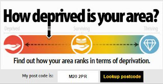
Hey, presto: a story which had fared quite badly in the past (without a gadget) suddenly became one of the most-read news stories on both the Mirror and the Manchester Evening News. People were sharing their results, talking about their results - and consequently talking about deprivation.
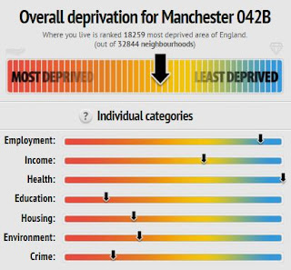
Are these people 'interested' in deprivation in precisely the way that the most noble-minded among us would like? Perhaps not. But they are interested in it.
Maybe they approach it through the prism of their own lives; but if our gadget shows them how lucky they are, and gets them thinking about other people who are far less lucky, I'd say that's more of a win than simply hoping that one day the world will be other than how it is.

East Jaywick: the most deprived neigbourhood in England. Do people elsewhere care?
Sadly, I live in a world in which we can measure exactly how interested people are in such things.
The answer, too often, is 'not very much'. The answer, too often, is 'I know it's important, but I don't really do the serious stuff'.
In order to identify a solution, we need to be clear about the nature of the problem.
First, the good news: in my experience, it's not that people can't be made to take an interest. It's just that it doesn't always come naturally, at least to most. Not in the way it comes naturally to click on a story about a celebrity doing an ill-advised thing while drunk, or a video of a street brawl, or expert analysis of a football game you just watched.
Second, the not-entirely-surprising news: in general people care more about their own lives than the lives of others, and more about the concrete than the abstract.
To illustrate the point, consider a story that says one in seven women continue to smoke in pregnancy, right up to the moment they give birth.
Will people be interested? To some extent.
But what if the story includes a specific person - a heavily-pregnant woman who gives an interview, and poses for pictures, arguing that she doesn't believe cigarettes are doing her unborn any harm, and in any case she doesn't intend to stop?
That story - the concrete, not the abstract - will get a lot more clicks. It will generate a lot more engagement, and a lot more debate.
And if a reader happens to know the woman in question - the personal, not the general - well, I can't imagine a single person who wouldn't click.
Perhaps that's just human nature. Whatever: there are lessons we can learn, and things data journalism can do to help.
Consider now the recently-published statistics on deprivation in neighbourhoods in England. These were undoubtedly important: they showed that pockets of just a few hundred families in the poorest parts of the country seemed to be trapped at the bottom of the pile, perpetually faring worst, in all respects, than upwardly-mobile places often just a stone's throw away.
Still, unless you lived in one of those neighbourhoods, how much would you actually care?
In order to address this - in order to give our coverage a concrete, personal aspect - we created a little gadget which enabled people to enter their postcode and find out exactly how deprived their neighbourhood was (or wasn't).
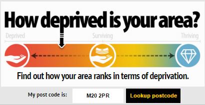
Hey, presto: a story which had fared quite badly in the past (without a gadget) suddenly became one of the most-read news stories on both the Mirror and the Manchester Evening News. People were sharing their results, talking about their results - and consequently talking about deprivation.
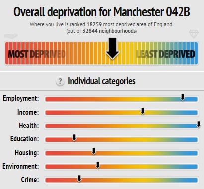
Are these people 'interested' in deprivation in precisely the way that the most noble-minded among us would like? Perhaps not. But they are interested in it.
Maybe they approach it through the prism of their own lives; but if our gadget shows them how lucky they are, and gets them thinking about other people who are far less lucky, I'd say that's more of a win than simply hoping that one day the world will be other than how it is.
Wednesday, 7 October 2015
Five random post-conference thoughts about politics

1. Jeremy Corbyn's best
hope is to be Jeremy Corbyn
Yes, those on the right
of the party are still pissed off that he won and will leap on him
with glee every time he fails to sing the national anthem, or talks
about nuclear weapons, or wears trousers that don't match his jacket.
So be it.
Jeremy Corbyn's USP is that he isn't part of the political
mainstream, the middle-ground consensus.
Can he win an election from
the left? Almost certainly not. I thought he was a terrible choice for the party and still do. But trying to force him into adopting
a few tokenistic centrist policies, or spending a fortune on spin
doctors to teach him how to walk and talk and dress, will just make him look inauthentic and weak. It would imply
the very thing that made him attractive – his difference, his
idealism – is something he would compromise for a sniff of power.
His only chance is if Britain really has changed as much as the
Labour party. I doubt that very much; but Jeremy Corbyn being Jeremy
Corbyn might at least change the way a few people think about
politics and politicians, stir some passions, frame some important
debates. That matters.
2. Like it or not, David Cameron is a
centrist at heart
It is frankly undeniable that David
Cameron has overseen significant changes in the Conservative party.
Today he got a standing ovation with a passionate plea for religious
tolerance and gender pay-equality. That simply wouldn't have happened
in the pre-Cameron era.
It's easy to forget he won the leadership
election with a positive, eco-friendly, modernising message. It's easy to
believe that lurking behind that message, always, was a true-blue
Thatcherite heart.
And yet, however strategically sensible it might
have been for him to pitch for the centre ground today, he didn't
have to. He has a majority. He is planning to stand down. He
can do what he wants for the next four years.
What he wants to do, I
suspect, is define his legacy. And he wants that legacy to be as a
leader of Britain, not a leader of the Conservatives.
3. Ed Miliband was a
disaster for Labour
Put simply, the party has learned the wrong
lessons from his defeat.
Ed Miliband didn't lose because of the
media. He didn't lose because he was too left wing, or too right
wing. And he didn't lose because he wasn't 'authentic'.
In fact, he
was: authentically Ed Miliband. A well-meaning, nice-enough, slightly
geeky, Islington socialist. A man who had never lived, and didn't
understand, the lives of the very 'hard-working families' he talked
about so much.
He never really spoke about schools and education. He
didn't recognise how much people might want to own their own homes.
Instead he focused on the extremes: the very poor and the very rich.
While plenty of people trying to raise a family on the median wage
(or just below) might think the 'bedroom tax' led to some unfair
outcomes, or that the very rich should contribute more in tax, these
really aren't their main concerns.
That doesn't make them awful
people. Ed Miliband had no intuitive understanding of those concerns.
So they didn't vote for him.
4. Politics is getting
more divisive
Win or lose, Jeremy
Corbyn has already achieved one thing: he has stirred and emboldened
those people on the left who might have thought 'mainstream' politics
deserted them during the Blair years.
The tens of thousands
who marched through Manchester this weekend did so in the belief, the
knowledge, that through the new Labour leadership they are now part
of the debate. Or rather, that their voice will now be heard. Whether
they are interested in listening is another matter.
Either way, the
ranks of the 'noisy disenchanted' will swell; anger will drive more
of the discourse; and it is hard to predict quite how that will
end. It's very easy for older hacks to claim that this is simply the
1980s all over again. But a glance over the border to Scotland should
show just how quickly politics can change in
remarkable ways.
5. The Liberal Democrats
are in serious trouble
The Liberal Democrat
conference seemed to pass by almost unremarked. You'd think Labour
vacating the central ground would present them with a real
opportunity. But no one appears to be talking about the Lib Dems.
That's bad. At least former Lib Dem voters felt something
about Nick Clegg, even if it was anger. Now it seems like a lot of
people don't feel anything about the Lib Dems at all.
Tim Farron is
going to have to work extremely hard simply to get a hearing. Cameron pitching for the centre ground will make things even worse.
It's
actually quite sad, in a way, to see a party which worked so hard to
get a footing – particularly in local government – have to
essentially start again from scratch.
Wednesday, 16 September 2015
What is an 'important' story in the age of the internet?
Recently, there was a fair bit of fuss made within the industry when one Trinity Mirror paper - the Birmingham Mail - 'admitted' it could no longer be a paper of record.
My instant reaction to this was: well, of course. The concept of a 'paper of record' has always seem to me to be a ludicrous journalistic conceit: there is something arrogant about the idea that you could boil down all the important things that had happened in the world, on any given day, to 20 or 30 pages.
No; that was never true, never could be true. I can't be the only former political hack who has had my oh-so-vital reports of scrutiny committee meetings and council debates knocked back to a 50-word brief, or left out of the paper altogether.
And how many incredible human-interest stories pass us by every single day, that we don't know about - let alone have chance to reject?
The classic paper of record - the Times - was once characterised by lengthy, turgid reports of parliamentary debates. Fine, I suppose. These days you can search Hansard in seconds if you are really interested in neutral presentations of that kind of thing. People don't, of course. But they could.
Were readers of the Times ever interested in that sort of content? We can't be sure. What we do know is that tabloid newspapers became the dominant force in British journalism based on the insight that choosing the stories that people actually wanted to read, boiling them down into the most gripping essentials, telling them in an entertaining way, showing a bit of character, breaking exclusives rather than simply regurgitating what had been said the previous day, were things readers might actually want.
The red-tops weren't 'papers of record', not like the Times of old. They never wanted to be. But they broke (and continue to break) big stories, and they found (and continue to find) plenty of space for 'serious' topics like politics, too (as Jeremy Corbyn, surely, will attest). They treated readers less like passive recipients of medicine - not enjoyable, but good for you - and more like consumers whose interests and values they shared. Autonomous individuals who were willing to listen, but could also make choices about what they wanted to read.
Now, in the age of the internet, people have all the choice they could ever imagine. Millions of pages of content, thousands of pages of news every day, on just those issues that they choose to seek. We aren't just fighting for readers to buy our papers. In an internet age, we have to fight to persuade them to read every little scrap of every single page.
So what are people who claim to want a 'paper of record', now, really saying? They are worried, I guess, that too many important stories will go by-the-by, in an age of limited resources and - yes - metrics that tell us who is reading what.
Here, then, is a more difficult question: what counts as an 'important' story, when we can measure exactly how interested people are in every single thing we write?
A casual glance at the 'most read' section of any given news website, on any given day, might make you think that the British people were obsessed with celebrities, soccer and videos of drunk people getting into fights. And - let's be honest - as consumers we do like those things. But scratch a bit deeper and the figures will show you that very large numbers of people can and will read about political issues, about health issues, about education issues. Those types of stories can be, an often are, in the 'most read' lists, too.
And why wouldn't they be? After all, 30.7 million British people voted in the general election this year - more people than have watched any television programme, ever. (Den divorcing Angie in EastEnders got 30.1 million, since you ask.) Everyone who has ever had a sick relative cares deeply about how good (or bad) their local hospital is. People move house to get their kids into a good school.
The trick with these 'important' issues is to tell stories in ways that people respond to; and maybe think harder about the stories we don't do (or shouldn't), as well as the way we tell the ones we do.
Because that's the point: no matter how important we think a story is, what can that possibly mean, if no one is reading it? Important to whom? Or if that isn't the right question - if we're claiming it is somehow intrinsically important - well, can anything be intrinsically important if no one notices?
If we believe, as journalists, that a story matters, then we have to find a way of telling it that makes people engage and share. Otherwise, ultimately, it doesn't matter at all. It can't. You can't start a debate, frame a debate, if no one hears your voice.
Metrics are a good thing. They make us ask difficult questions. They make us work harder. They make us treat our readers like human beings with their own concerns and interests. We might not always like the lessons we learn from the data; we might sometimes wish the world were different.
But we can also embrace the challenge and use the power of data to help us connect with our readers, tell them 'important' things in engaging new ways, and maybe change the world one small step at a time.
After all, isn't that what great journalism has always been about?
My instant reaction to this was: well, of course. The concept of a 'paper of record' has always seem to me to be a ludicrous journalistic conceit: there is something arrogant about the idea that you could boil down all the important things that had happened in the world, on any given day, to 20 or 30 pages.
No; that was never true, never could be true. I can't be the only former political hack who has had my oh-so-vital reports of scrutiny committee meetings and council debates knocked back to a 50-word brief, or left out of the paper altogether.
And how many incredible human-interest stories pass us by every single day, that we don't know about - let alone have chance to reject?
The classic paper of record - the Times - was once characterised by lengthy, turgid reports of parliamentary debates. Fine, I suppose. These days you can search Hansard in seconds if you are really interested in neutral presentations of that kind of thing. People don't, of course. But they could.
Were readers of the Times ever interested in that sort of content? We can't be sure. What we do know is that tabloid newspapers became the dominant force in British journalism based on the insight that choosing the stories that people actually wanted to read, boiling them down into the most gripping essentials, telling them in an entertaining way, showing a bit of character, breaking exclusives rather than simply regurgitating what had been said the previous day, were things readers might actually want.
The red-tops weren't 'papers of record', not like the Times of old. They never wanted to be. But they broke (and continue to break) big stories, and they found (and continue to find) plenty of space for 'serious' topics like politics, too (as Jeremy Corbyn, surely, will attest). They treated readers less like passive recipients of medicine - not enjoyable, but good for you - and more like consumers whose interests and values they shared. Autonomous individuals who were willing to listen, but could also make choices about what they wanted to read.
Now, in the age of the internet, people have all the choice they could ever imagine. Millions of pages of content, thousands of pages of news every day, on just those issues that they choose to seek. We aren't just fighting for readers to buy our papers. In an internet age, we have to fight to persuade them to read every little scrap of every single page.
So what are people who claim to want a 'paper of record', now, really saying? They are worried, I guess, that too many important stories will go by-the-by, in an age of limited resources and - yes - metrics that tell us who is reading what.
Here, then, is a more difficult question: what counts as an 'important' story, when we can measure exactly how interested people are in every single thing we write?
A casual glance at the 'most read' section of any given news website, on any given day, might make you think that the British people were obsessed with celebrities, soccer and videos of drunk people getting into fights. And - let's be honest - as consumers we do like those things. But scratch a bit deeper and the figures will show you that very large numbers of people can and will read about political issues, about health issues, about education issues. Those types of stories can be, an often are, in the 'most read' lists, too.
And why wouldn't they be? After all, 30.7 million British people voted in the general election this year - more people than have watched any television programme, ever. (Den divorcing Angie in EastEnders got 30.1 million, since you ask.) Everyone who has ever had a sick relative cares deeply about how good (or bad) their local hospital is. People move house to get their kids into a good school.
The trick with these 'important' issues is to tell stories in ways that people respond to; and maybe think harder about the stories we don't do (or shouldn't), as well as the way we tell the ones we do.
Because that's the point: no matter how important we think a story is, what can that possibly mean, if no one is reading it? Important to whom? Or if that isn't the right question - if we're claiming it is somehow intrinsically important - well, can anything be intrinsically important if no one notices?
If we believe, as journalists, that a story matters, then we have to find a way of telling it that makes people engage and share. Otherwise, ultimately, it doesn't matter at all. It can't. You can't start a debate, frame a debate, if no one hears your voice.
Metrics are a good thing. They make us ask difficult questions. They make us work harder. They make us treat our readers like human beings with their own concerns and interests. We might not always like the lessons we learn from the data; we might sometimes wish the world were different.
But we can also embrace the challenge and use the power of data to help us connect with our readers, tell them 'important' things in engaging new ways, and maybe change the world one small step at a time.
After all, isn't that what great journalism has always been about?
Sunday, 6 September 2015
Mapping asylum, continued
Here's a geographically accurate map of Europe:

Now, here's what happens when we adjust the area of each country according to the number of asylum seekers each nation registered as arriving between April and June this year:

Hopefully you'll notice straight away that it isn't the UK which has swollen significantly in size. It's central Europe - in particular Germany and Italy - and Sweden, too.
That's because while the UK received 32,300 applications from adults and their dependents, Italy received 63,700 - nearly twice as many. Sweden received 81,300. And Germany? Germany received 173,100.
Even that, though, doesn't really give a sense of the 'burden' - if such a word is appropriate - that each country is carrying when it comes to refugees. Germany, after all, has a significantly larger population than other European nations. So I suppose you could argue that Germany can comfortably accommodate a higher number of refugees.
So here's a final cartogram. In this one, the size of each country is determined solely by the proportion of the current population who are asylum seekers:

Suddenly the UK doesn't look so big. And it isn't: as a proportion of the total population, Sweden has 16 times more asylum seekers than we do. Hungary has around eight times as many. We may be a European giant in economic terms; when it comes to taking in refugees, despite all the sensationalist headlines, we are far from a major player.

Now, here's what happens when we adjust the area of each country according to the number of asylum seekers each nation registered as arriving between April and June this year:

Hopefully you'll notice straight away that it isn't the UK which has swollen significantly in size. It's central Europe - in particular Germany and Italy - and Sweden, too.
That's because while the UK received 32,300 applications from adults and their dependents, Italy received 63,700 - nearly twice as many. Sweden received 81,300. And Germany? Germany received 173,100.
Even that, though, doesn't really give a sense of the 'burden' - if such a word is appropriate - that each country is carrying when it comes to refugees. Germany, after all, has a significantly larger population than other European nations. So I suppose you could argue that Germany can comfortably accommodate a higher number of refugees.
So here's a final cartogram. In this one, the size of each country is determined solely by the proportion of the current population who are asylum seekers:

Suddenly the UK doesn't look so big. And it isn't: as a proportion of the total population, Sweden has 16 times more asylum seekers than we do. Hungary has around eight times as many. We may be a European giant in economic terms; when it comes to taking in refugees, despite all the sensationalist headlines, we are far from a major player.
Saturday, 5 September 2015
Asylum seekers in England, in cartograms
Ah, cartograms. Those funny squashed maps where the size of an area - a region, say, or a country - represents not the actual geography, but a variable.
That could be total population. Or number of millionaires. Or average house prices. Or death rates from cancer.
It could be anything, really.
Cartograms have their drawbacks. They can be misleading, I think, by making small absolute numbers seem terrifyingly large. They can also be messy and confusing.
Done right, though, they can be a very useful way of drawing at-a-glance, intuitive comparisons between different areas.
With the plight of Syrian refugees at the top of the news agenda - and a domestic debate about whether we can 'take' any more asylum seekers - I've been having a closer look at the latest asylum statistics, which run to June this year.
The data shows how many asylum seekers are currently receiving so-called 'section 95' support from the British government. This can be in the form of money, and also in the form of accommodation.
In order to receive section 95 support, an asylum seeker must be 'destitute'. This is defined as not having 'adequate accommodation or enough money to meet living expenses for themselves and any dependents now or within the next 14 days'.
The offer of accommodation is the most controversial. Under an official dispersal programme - aimed at 'spreading the load' to places outside London - anyone wanting accommodation will more than likely find themselves hundreds of miles from the capital, and in a place that is certainly not of their choosing.
Critics have suggested some areas are pulling far more weight than others - with potentially negative consequences for all concerned.
But to what extent is it true that the dispersal has been skewed?
First, here's a geographically-accurate map of the English regions:

Now, here's what happens if we change the map into a cartogram where the size of each region corresponds to the total population of that region:

London suddenly becomes much bigger. The south west, which is relatively sparsely populated, looks a bit skinny. The south east looks a tiny bit fat.
Before we start adding in data on asylum seekers, there is a very important caveat to bear in mind.
The total number of asylum seekers receiving section 95 support stands at just over 80,000 across the whole of the UK.
The total population of the UK is 64 million.
That means only one person in 800 is a supported asylum seeker.
The numbers are relatively tiny, and politicians (and others) would do well to remember that when talking about these issues.
With that in mind, here what happens if we make the size of each region correspond to the total number of supported asylum seekers in that region:

Two things stand out. Firstly, despite the dispersal programme, London is still supporting significantly more asylum seekers than any other region.
They may not be getting accommodation; but they are staying in the capital, somewhere and somehow.
But a second feature is equally striking. The south west, east of England and (to a lesser extent) the south east have virtually disappeared from the cartogram. That's because the south west is supporting just 1,668 of the 80,000 asylum seekers in the UK; the east of England just 1,944.
Those are very small proportions indeed.
Finally, let us look at the dispersal programme.
Here is a cartogram where the size of each region represents the number of asylum seekers in section 95-supported accommodation:

This is hugely top-heavy. Why? Because the government's 'dispersal' programme doesn't mean dispersal around the country. It means dispersal, by and large, to the west Midlands and the north.
I wouldn't invite you to draw any major conclusion from these cartograms, other than this: if someone from the south west, south east, or east of England starts telling you how 'we can't take any more asylum seekers', they probably aren't basing their opinion on data, but on something else.
You can decide for yourself what that something might be.
(These cartograms were created with the fantastic tool Scapetoad. I'd also like to thank Boston-based software developer Zia Sobhani for answering questions I had about using shapefiles. You can see some of her blogs about cartograms here and here.)
That could be total population. Or number of millionaires. Or average house prices. Or death rates from cancer.
It could be anything, really.
Cartograms have their drawbacks. They can be misleading, I think, by making small absolute numbers seem terrifyingly large. They can also be messy and confusing.
Done right, though, they can be a very useful way of drawing at-a-glance, intuitive comparisons between different areas.
With the plight of Syrian refugees at the top of the news agenda - and a domestic debate about whether we can 'take' any more asylum seekers - I've been having a closer look at the latest asylum statistics, which run to June this year.
The data shows how many asylum seekers are currently receiving so-called 'section 95' support from the British government. This can be in the form of money, and also in the form of accommodation.
In order to receive section 95 support, an asylum seeker must be 'destitute'. This is defined as not having 'adequate accommodation or enough money to meet living expenses for themselves and any dependents now or within the next 14 days'.
The offer of accommodation is the most controversial. Under an official dispersal programme - aimed at 'spreading the load' to places outside London - anyone wanting accommodation will more than likely find themselves hundreds of miles from the capital, and in a place that is certainly not of their choosing.
Critics have suggested some areas are pulling far more weight than others - with potentially negative consequences for all concerned.
But to what extent is it true that the dispersal has been skewed?
First, here's a geographically-accurate map of the English regions:

Now, here's what happens if we change the map into a cartogram where the size of each region corresponds to the total population of that region:

London suddenly becomes much bigger. The south west, which is relatively sparsely populated, looks a bit skinny. The south east looks a tiny bit fat.
Before we start adding in data on asylum seekers, there is a very important caveat to bear in mind.
The total number of asylum seekers receiving section 95 support stands at just over 80,000 across the whole of the UK.
The total population of the UK is 64 million.
That means only one person in 800 is a supported asylum seeker.
The numbers are relatively tiny, and politicians (and others) would do well to remember that when talking about these issues.
With that in mind, here what happens if we make the size of each region correspond to the total number of supported asylum seekers in that region:

Two things stand out. Firstly, despite the dispersal programme, London is still supporting significantly more asylum seekers than any other region.
They may not be getting accommodation; but they are staying in the capital, somewhere and somehow.
But a second feature is equally striking. The south west, east of England and (to a lesser extent) the south east have virtually disappeared from the cartogram. That's because the south west is supporting just 1,668 of the 80,000 asylum seekers in the UK; the east of England just 1,944.
Those are very small proportions indeed.
Finally, let us look at the dispersal programme.
Here is a cartogram where the size of each region represents the number of asylum seekers in section 95-supported accommodation:

This is hugely top-heavy. Why? Because the government's 'dispersal' programme doesn't mean dispersal around the country. It means dispersal, by and large, to the west Midlands and the north.
I wouldn't invite you to draw any major conclusion from these cartograms, other than this: if someone from the south west, south east, or east of England starts telling you how 'we can't take any more asylum seekers', they probably aren't basing their opinion on data, but on something else.
You can decide for yourself what that something might be.
(These cartograms were created with the fantastic tool Scapetoad. I'd also like to thank Boston-based software developer Zia Sobhani for answering questions I had about using shapefiles. You can see some of her blogs about cartograms here and here.)
Sunday, 23 August 2015
What data journalism means to me
So I told someone recently I was a data journalist.
I'm interested in this because I think it can teach us valuable lessons.


"Define 'data journalism'," they said.
"No," I replied.
"Why not?" they asked.
"Because it's an incredibly tedious thing to do," I said. "And anyone who thinks it is important to define data journalism precisely is likely to be doing it really, really badly."
I'm paraphrasing. In real life I'm not that much of an asshole. But it's basically what I said, and certainly what I believe.
The fact is, I am not interested in precisely defining data journalism. I am interested in practising data journalism, and how other people practise it.
I am interested in brilliant content - content that is valuable; content that is unique; content that people actually want to read, share and engage with.
I am interested in how we harvest the sea of information that is now available to anyone with a computer, tablet or mobile phone.
Information being pumped out, in real time, in the guise of data feeds.
Information being published by governments in the form of spreadsheets that no one seems to bother to read.
Information - stories, scandals even - hiding in plain sight.
Now, okay. If we can't construct any kind of definition of data journalism, then it becomes a meaningless concept.
I wouldn't want that.
But I'm with Wittgenstein on these things. I think data journalism is defined primarily by practice. I also believe it is a classic Wittgensteinian 'vague concept'.
Like sport.
Some things are clearly sports (rugby, say). Some things are clearly not sports (having a bath, for example). And then there are things in between.
Is darts a sport? It has certain 'sporty' features, like precision improved with training, competition, etc etc.
It has 'non-sporty' features, too, in that it isn't physically taxing, and (at least if you are an amateur) drinking beer can make you better at it.
So is darts a sport?
Dunno. Don't care. There is no categorical answer because the concept 'sport' isn't precisely defined.
That doesn't mean there is no such thing as sport. Or that darts is any greater, or lesser, an activity, for being, or not being, a sport.
Is Phil Taylor a sportsman?
Dunno.
Is Phil Taylor amazing?
Yes.
Same with data journalism. Some things are data journalism. Some things are not data journalism. Some things are like darts: borderline. Are they data journalism? Are they not?
I'm not interested in that. I'm interested in whether they are amazing.
Having said all that, I am interested in the ways people try to over-define data journalism; to exclude things as not really data journalism at all.
I'm interested in this because I think it can teach us valuable lessons.
One the one hand, you have those people who say: "That isn't really data journalism."
We got this, for example, when we did our 'Pick your horse with data' gadget for the Grand National. This was, clearly, a bit of fun: a bit of fun aimed at people (like me) who don't just want to stick a pin in a list of names, but also don't want to spend hours and hours poring over every horse's performance in every race on every type of going etc etc.
It was a bit of fun.
It involved programming. And algorithms. And visualisation.
But it was definitely a bit of fun.
Was it 'journalism'?
Dunno.
Was it fun? Was it original? Did people love it?
Yes.

Then, at the other end, you have those who say: "This isn't really data journalism."
Often this is simply code for: it wasn't visibly complicated enough for me.
Or: there weren't enough really difficult maths in it for me.
These seem odd complaints. It seems to me that if we want to connect with a mass audience then the difficult stuff should happen in the background; swans' frantic feet below the water, if you like, allowing for the serene progress above.
Also, I think people confuse 'statistics journalism' with 'data journalism'.
I define 'data' the classical way: as information. There is nothing intrinsically mathematical about it.
For me, data journalism is essentially about applying advanced techniques for finding and interrogating information in the service of journalism in a digital age.
That might involve scraping websites, knowing how to properly use spreadsheets, having programming skills, visualising data, and using and understanding data feeds.
Data journalism might involve all of these at once. Or more often some. Or sometimes none at all.
A final point. When Claire Miller and I set up the data unit, we defined two different work streams.
One was 'news', as classically understood. A perishable commodity with a 'line' or hook. We wanted to use data journalism techniques to create front-page news.
The other was 'resources'. By this we meant data journalism projects or tools which would be enduringly useful and which our readers could use to find and explore relevant information about their local schools, hospitals, crime rates or whatever.
I said at the start of this post I defined data journalism by practice.
For me, these splashes - based on some quite sophisticated statistical analysis by Claire of datasets that are not usually put together - were very much 'data journalism':


But then so was this one, based on a round-robin FOI that generated responses collated into a master spreadsheet that could then be sorted to generate a very simple but newsworthy line:

And so was this data scrape of sheet music by the data unit's Patrick Scott to find the modern singer with the greatest vocal range:

And so was Rob Grant's painstaking data-processing of more than a million records held by the Commonwealth War Graves Commission, which technical savvy allowed him to turn into such incredibly detailed (and moving) insights into local losses in World War One as this, for Liverpool:
All of these are 'data journalism'. And I'm proud of every one.
Only I'm not proud of them because they are data journalism. I'm proud because they are bloody good.
Subscribe to:
Posts (Atom)